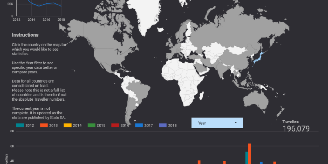
Tourism Update has created a platform to visualise inbound tourism statistics to South Africa. Taking statistics for each overseas country from January 2012 through to September 2018, the platform allows you to interrogate year, month and country statistics using the Google Data Studio system.
Data visualisation is quicker and easier to interpret than words. "A good sketch is better than a long speech," said Napoleon Bonaparte. The graphic interface enhances the experience to actually see changes over time and identify patterns.
We would like your help to interpret the statistics by sending us your reading of the statistics and what has influenced them over time. Email us at editor@tourismupdate.co.za.
Click here to view the platform.
The platform has a number of pages. Use the arrows at the bottom left of the website to navigate.
Page 1 – Global overview by month
Page 2 – Europe by country
Page 3 – Asia/Middle East by country
Page 4 – Americas by country
The system is very interactive – you need to click on countries, years and months to activate filters and shape the content of your visualisations.
If you find any errors or would like to see other statistics displayed this way, please send us an email.
See any major spikes or dips in the statistics? Tell us the year/month, and source market where relevant, and why you believe the pattern changed. Email your observations to editor@tourismupdate.co.za.


